top of page

From Value to First Log
Background
This project focused on helping new users reach their first key action: logging a diary. We also guided them to review their blood sugar goals and discover the chatbot, helping them understand the app’s core value from the start.
After launch, first-day diary completion increased from 18.65% to 25.21% (+35%).
As the sole designer, I led the end-to-end process from research to delivery, collaborating with a PM and engineers while independently pulling and analyzing the product data.
Problem Exploration
Research Method: Task Walkthrough + Think-Aloud
We invited three users aged 56–59 to participate in an in-person task-based usability test to understand their journey from downloading the app to reaching the home screen (Dashboard) for the first time.
Participants completed the journey from downloading the app to reaching the Dashboard while thinking aloud, allowing us to capture their actions and reactions along the way.
-Mapping the full first-time user journey-
What we observed

From Insight to Decision
After reviewing the research findings and product priorities with the team, we decided to focus on the first-time experience after users land on the Dashboard.
The testing also revealed different user behaviors: some users needed a clear next step, while others skipped the guidance and preferred to explore on their own.
I then used Persona and Competitor Review to further understand these different guidance needs and explore the right approach.
Research & Design Direction
Who Are We Designing For?
Based on previous user interviews and an analysis of registered users who had not logged a diary, I identified two representative personas to clarify different user needs and guide the design direction.

Persona 1 needed clear guidance, while Persona 2 preferred less guidance. We then reviewed other diabetes apps to see how they balanced these needs while addressing the issues uncovered in our interviews.

Research Findings
We observed two approaches: structured guidance helps new users get started, while independent exploration reduces disruption. Each comes with its own trade-offs.
Design Decision
We chose a balanced approach: providing temporary, non-intrusive guidance that gives users a clear starting point while preserving the freedom to explore.
Design Strategy
Goals
Phase 1: Create a clear starting point, guiding new users to complete their first diary entry and key tasks.
Phase 2: Personalize the activation journey based on users’ conditions.
Further Exploration
I mapped key touchpoints for new users to identify areas that impact the first-time experience and are worth further exploration.

Problem Focus

🔍 Homepage Friction:The homepage lacks a clear starting point for new users.
🔍 Empty-State Opportunity:Show the value of logging before users have any data.

Design Solution
➊ Guide new users to complete their first diary and discover the app’s value.
A. Create a Clear Starting Point
BEFORE
Guidance was fragmented across the Slider and tooltip, while the core logging action was not prominent enough in the navigation.
SOLUTION
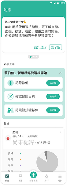
We introduced a temporarily visible Beginner’s Card to bring key actions together and create a clear starting point, while preserving room for independent exploration.
B. Make the Core Logging Action Clearer
BEFORE
The Dashboard Card’s “No Data” state could be confusing, while the core “Add Diary” action was not prominent enough in the navigation.
SOLUTION
We clarified the empty state with “Not Logged Yet” and emphasized “Add Diary” in the navigation, making the core logging action easier to understand and access.
C. Make the Value of Logging Visible Before Users Start
BEFORE
When no diary entries had been recorded yet, new users had little visibility into what they could gain from logging and lacked a clear path to get started.
SOLUTION
Preview logging insights and provide a direct entry point in the Empty State, helping users see the value and start logging.


➋ Designing for Users Who Prefer Independent Exploration

A. Keep Guidance Lightweight and Non-Intrusive
BEFORE
Too much or mandatory guidance can interrupt users who prefer to explore on their own.
SOLUTION
We used subtle animations and completion feedback to guide key tasks, limiting them to three so users could progress at their own pace.
Hero Illustration
We used hero illustrations on the Goal and Routine pages to create a clear visual focus and help users quickly understand each page’s purpose.


Design Outcomes
Rapid Usability Test
Tested with 3 target users to validate whether the onboarding could help them understand and complete key tasks before launch.

Findings & Pre-launch Optimizations
👍 What Worked
-
Onboarding helped users understand what to do next
Users understood the purpose of the guidance and successfully completed diary logging, goal setting, and the Partner Chatbot experience.
-
Bubbles and toasts effectively guided key actions
The prompts captured users’ attention and helped them complete key actions.
🔧 Pre-launch Optimizations
-
Adjusted prompt timing
Bubbles and toasts now appear after users enter the Beginner’s Guide, reducing interruptions for users who prefer to explore independently.
-
Clarified task naming
Renamed “View Health2Sync Assistant” to “Meet Your Health2Sync Partner” to make the task purpose clearer.
📈 Impact
More new users completed their first diary entry on the day they registered after the onboarding redesign.
First-Day Diary Completion Funnel
The funnel shows how new users progressed from completing onboarding → starting a diary → completing their first diary entry.

What's Next
-
Encourage more new users to start the three Beginner’s Guide tasks.
-
Although 85% of users tapped “Log Data,” only 34% completed their first diary entry. The next goal is to increase this completion rate to over 50%.
-
Users who log more diary entries show higher engagement. The next step is to encourage continued logging and strengthen retention.

bottom of page