
From Value to First Log
Background
This project focused on helping new users reach their first key action: logging a diary. We also guided them to review their blood sugar goals and discover the chatbot, helping them understand the app’s core value from the start.
After launch, first-day diary completion increased from 18.65% to 25.21% (+35%).
As the sole designer, I led the end-to-end process from research to delivery, collaborating with a PM and engineers while independently pulling and analyzing the product data.
Problem Exploration

Research Method: Task Walkthrough + Think-Aloud
We conducted face-to-face task walkthroughs with 3 users aged 56–59 to understand how new users actually landing to the app.
Participants completed the journey from downloading the app to reaching the Dashboard while thinking aloud, allowing us to capture their actions and reactions along the way.
What we observed
-
Tester 01 (56, F)
Skipped through onboarding without fully understanding the content and never noticed the tooltip guiding her to log her first diary.
-
Tester 02 (59, M):
Skipped most onboarding content. Although he understood the app’s purpose, he didn’t know what to do after reaching the Dashboard.
-
Tester 03 (59, M) :
Couldn’t tell whether his data had been saved, revealing a gap between user input and system feedback.
Shared pattern
Key Issues
-
No clear starting point: Users didn’t know what to do after reaching the Dashboard.
-
Unclear empty state: “No data” was interpreted as a system or data issue.
From Insight to Decision
After reviewing the findings with the team, we prioritized the post-onboarding experience. Since users overlooked the existing tooltip, we replaced it with a persistent Beginner’s Card to provide a clearer starting point on the Dashboard.
Research & Design Direction
Who Are We Designing For?

Based on previous user interviews, we outlined two representative personas to identify the key needs our design should account for.
These personas highlighted two needs to balance:
-
Provide enough guidance for users who need support.
-
Preserve flexibility for those who prefer to explore independently.
We then looked at how other diabetes apps approached this balance.

What We Learned
Two approaches emerged: One Drop and Glucose Buddy use structured guidance to help new users get started, while 糖糖圈 gives users more freedom to explore. Each approach supports different user needs, but also comes with trade-offs.
Design Decision
We chose a middle ground: a persistent but non-blocking Beginner’s Card that provides a clear starting point while preserving the freedom to explore.
Design Strategy
Goals
Phase 1: Build a core activation journey for all new users.
Phase 2: Personalize the activation journey based on users’ conditions.
Opportunities


I mapped the product structure and walked through the new-user journey to identify key friction points and opportunities for improvement. The key opportunity was to give new users a clearer starting point and help them understand the value of logging before they had any data.
➊ Guiding New Users to Their First Diary Entry
a. Beginner’s Card
Before: All three users overlooked the tooltip guiding them to log their first diary entry.
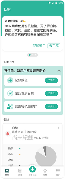
Solution: We replaced the passive tooltip with a persistent Beginner’s Card on the Dashboard, giving new users a clear starting point without blocking exploration.
The card highlights three key actions: log the first diary entry, review blood sugar goals, and discover the chatbot, helping users experience the app’s core value from the start.
b. Enhance clarity in the "add diary" process
Before: The Dashboard Card originally displayed "尚無資料" (no data), which Tester 03 read as a system error — asking "is my data still there?" — rather than an invitation to start logging.
To improve clarity, adjust the Dashboard Card from "尚無資料" to “尚未紀錄”or ”開始記錄第一筆“.
This change will better communicate the user's current status and avoid confusion about data import.
In the Navigation, all functions appear at the same hierarchical level.
Highlighting "新增日記" emphasizes the app's key value action to users and makes it easier for them to find the feature.


c. Enhancing User Engagement through Aha Moments in Homecard Page
Before: The empty Homecard gave users no reason to believe logging data would be valuable — there was nothing to visualize, so the benefit stayed abstract.
In the homecard Page, we display an Empty Status with numerical analysis to help users visualize the analytics after 'recording diary entries.
This moment allows users to experience the "Aha moment" of the value of diary recording. Strengthening guidance at this juncture encourages users to start recording diaries, thereby increasing their chances of achieving their goals.
➋ Designing for Persona 2: users who resist being guided.
a. Enhancing User Onboarding with Animation and Task Limitation
a-1:
Guidance comes in many forms, and discuss to PM and team the decision-making, we've opted for subtle yet noticeable animations to reduce user resistance and increase their willingness to proceed step by step.
a-2:
Users need motivation, so we use Lottie animations to help new users feel accomplished after completing a task.
The goal is to encourage them to complete each of the three tasks thoroughly and gain a better understanding of the app onboarding process.
a-3:
We limit task guidance to a maximum of three, primarily considering user patience.


Design Outcomes
Hero Illustration
Place the hero illustration in the most prominent area of the Goal Page and Routine Page to grab attention and highlight the purpose of each page.

Rapid Usability test
To improve the new user registration experience, we tested three typical users. We focused on:
-
The registration guidance process.
-
Completing three tasks.
-
The ease of completing tasks.
After testing, we discussed the results and created a report. We identified key insights and prioritized them to enhance our design assumptions.

Findings & Optimizations
👍 The parts that align with the design strategy
-
Users feel comfortable with the "beginner's guide" task card, which helps them understand what they need to do and successfully complete diary entries.
-
Users clearly understand the main functions of the app: diary recording and analysis.
-
Bubble and toast animations effectively catch the attention of Users and guide them successfully.
-
The addition of visual elements on the "goal setting page" enhances the explanation of its purpose, encouraging users to scroll down and view their goals.
🔧 Optimizations
-
Adjust the timing for displaying Bubbles and Toast to appear only when users click on the Beginner's Card task, which is more user-friendly for those who prefer autonomous exploration.
-
Users found the task "查看智抗糖小幫手" unclear in its purpose, so it has been renamed to "認識智抗糖夥伴".
Performance
Task Completion Funnel
More than half of new users tried at least 1 task:
- 85.25% tried "log data"
- 16.03% tried "learn about H2 chatroom"
- 7.77% completed all 3 tasks
- Only 34% of users who tried "log data" actually created their first diary that day
Before / After Comparison
First diary on registration day: 18.65% → 25.21% (+35%)
- Reached H2 chatroom on registration day: 17.72% → 18.84% (+6%)
- Recorded >2 diaries in the 1st month: 24.23% → 26.37% (+8%)
The funnel below shows the full breakdown behind the first-diary completion rate:

What's Next
-
Encourage more new users to try to do the 3 beginner’s tasks.
-
Even though 85% of users tapped “log data,” only 34% finished it. We aim to raise that to over 50%.
-
The more diaries users log, the more engaged they become. We need to guide them to keep recording more entries to improve retention.