top of page

E-commerce Mweb Revamped
Background
As Google Ads brought in more new users, VeryBuy revamped its MWeb shopping experience to improve the journey after users landed from ads and create a more consistent experience between MWeb and the app.
As the app had been continuously optimized and established a more mature shopping flow, the new MWeb built on its existing design foundation while adapting key experiences to mobile browser behaviors, including product discovery, variant selection, and checkout.
After launch, the team used VeryBuy’s 9th Anniversary traffic peak to validate the revamp, tracking add-to-cart rate, browsing behavior, and overall user experience. These results informed further optimizations for the upcoming Double 11 campaign.
Business Goal
➊ Phase 1 | 9th Anniversary Campaign
Leverage the traffic generated by VeryBuy’s 9th Anniversary campaign to familiarize users with the revamped MWeb experience.
Track key metrics to evaluate whether the new version meets or exceeds the performance of the previous MWeb and validate the impact of the revamp.
➋ Phase 2 | Double 11 Shopping Festival
If the 9th Anniversary results meet expectations, further optimize the shopping experience for Double 11.
Design Goal
Since apps and mobile browsers have different interaction patterns, directly applying the App interface to MWeb could result in a less intuitive browsing experience.
The revamp therefore aimed to maintain a consistent experience with the App while adapting to mobile web behaviors, ensuring users could browse and shop smoothly.
Personas
Who are we designing for? 3 Types of Mature Female Users

Based on our persona research, we identified three types of mature female users as our primary target audience. Their characteristics and preferences were key considerations in achieving our project goals.
The personas were developed through one-on-one interviews, literature reviews, and data analysis, helping the team understand users’ goals, expectations, and purchase motivations.
To increase new users’ add-to-cart rate and average browsing time, we focused on these three personas and used their preferences to shape product presentation, interface copy, and user experience, with the goal of improving engagement and loyalty.
Core Shopping Journey Optimization

➊ Product Size & Color Selection Optimization
BEFORE
In the previous MWeb, users had to select product variants through multiple dropdown menus.
This increased the time needed to select and confirm product options, making the purchase decision process longer.
AFTER
All product variants are consolidated into a single dialog, allowing users to quickly confirm their selections and reduce interaction time.
Selecting a variant also updates the corresponding product image, helping prevent errors and speed up checkout.
➋ Coupon Experience Optimization
BEFORE
The old MWeb only provided discount codes, requiring users to remember and enter them manually, adding friction to the checkout process.
AFTER
Ⓐ The new MWeb introduces a Coupon Area where users can collect and save coupons with one tap. Delightful animations provide positive feedback, while available coupons can be easily selected during checkout for the best discount.
Ⓑ The single-page checkout is simplified into two steps: confirming items and coupons, followed by shipping and payment.
The checkout CTA remains visible and easy to reach throughout both steps, reducing the time and effort needed to complete a purchase.

➌ Product Discovery & Recommendation Optimization

BEFORE
The homepage is a key entry point for product discovery, but the old version showed limited products and relied mainly on curated popular items and styling themes, making it harder to address different browsing preferences.
AFTER
Ⓐ Personalized Recommendations
Based on product tags from a new user’s first viewed item, relevant and high-click products are recommended to help users discover items that match their preferences and current trends.
Ⓑ Homepage Product Discovery
Along with new arrivals and popular items, infinite scrolling with “You May Also Like” was added to the bottom of the homepage, allowing users to continuously browse and discover more relevant products.
How Can Design Strategies Improve the MWeb Browsing Experience?
What Problem Are We Solving?
Since MWeb and the App have different interaction patterns, the MWeb browsing experience needed to be adapted to better match mobile web behaviors.
Problems & Solutions
“ We introduced a shared Header and Hamburger Menu across the new RNWeb to improve navigation and create a smoother browsing experience. ”

The Header and Hamburger Menu provide convenient and intuitive navigation as users continue exploring products.
However, the Header and Hamburger Menu are hidden during checkout to reduce distractions and keep users focused on completing their purchase.
Search and product detail pages also use different Hamburger Menu configurations based on their specific browsing contexts.
➊ Header Configuration

Ⓐ. item Detail Page

Ⓑ. Homepage
Feature layout : Search, Share, Add to Favorites
⬅️ Feature layout : Notifications, Profile, Cart
On the product detail page, the Hamburger Menu helps users explore other content, while Search, Share, and Favorites remain in the right header for quick access.
If users land on a product through an ad but are not interested, they can search for other products directly.
Sharing lets users send products to friends and family, while Favorites helps them save items they like and continue exploring.
On the homepage, the header supports casual product exploration. Key features guide users to important pages, encourage new user registration, and keep the cart visible.
➡️ Feature Layout: Notifications · Search · Profile · Cart
As users scroll down, a search bar with popular keywords appears in the header. If they cannot find what they want, they can search for other products directly.

Ⓒ. Search Page
Feature Layout: Search · Popular Keywords
When users tap the search bar, they enter the Search page, where popular keywords and outfit recommendations help them continue exploring products.
➋ Hamburger Menu Layout Strategy
Ⓐ
Ⓑ

Ⓒ
Ⓓ
Ⓔ
Ⓕ
Ⓐ Register / Login
Aligned with the business goal, encouraging new users to register is a key task. Since users opening the menu are often exploring freely, this section remains lightweight to avoid interrupting their browsing.
Ⓑ Featured Products
All product categories are grouped under Featured Products with icons that reflect VeryBuy’s visual style, helping users quickly explore different categories.
Ⓒ Policies / About VeryBuy
Policies and brand information help new users build trust and learn more about VeryBuy. This section uses a lower visual hierarchy to avoid distracting from product browsing.
Ⓓ App Download
After users browse products and build trust in the platform, the App banner encourages interested users to download the App and become new App users.
Ⓔ Social & Services
Social media and service links allow users to learn more about the brand and explore VeryBuy’s community content.
Ⓕ Switch to Classic MWeb
The option to switch back to the classic MWeb allows users who are not yet familiar with the new interface to browse as before, while helping the team observe adoption of the new RNWeb.
➌ New RNWeb Announcement & Tutorials
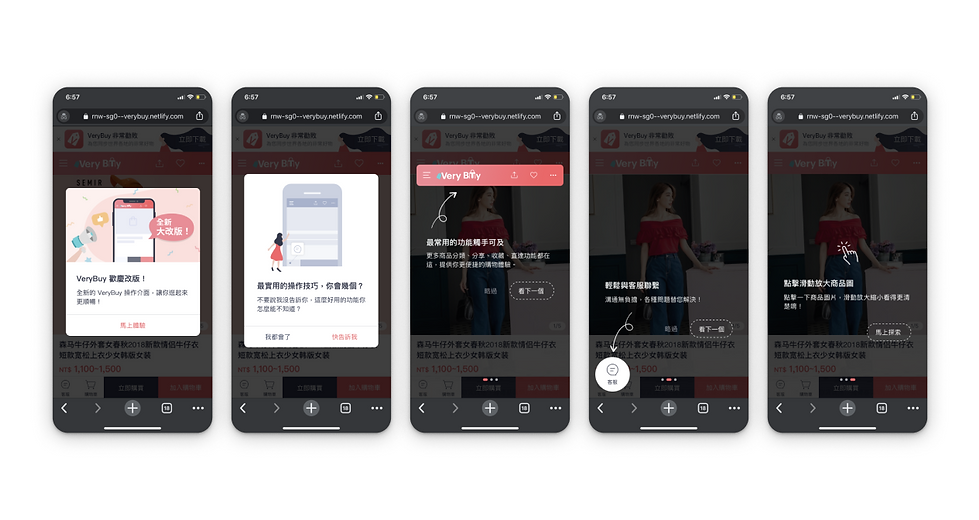
Ⓐ Revamp Announcement
Use celebratory visuals and illustrations to introduce the new RNWeb experience.
Ⓑ Tutorial Timing
After tapping “Try It Now,” users first see the product they were interested in from the ad. A lightweight tutorial appears on the second product to help them get familiar with the new RNWeb.
Ⓒ Lightweight Tutorial
The tutorial focuses on three key actions on the product detail page: Header Navigation, Customer Service, and Zooming In on Product Details.
Only essential actions are included to avoid interrupting the shopping experience. A “Skip” option is also provided for users who prefer to continue browsing without the tutorial.
Usability Test
Business Goal Validation
Ensure users from paid ads can browse products smoothly and complete key actions such as adding to cart and placing orders.
Design Goal Validation
Use usability testing to understand shopping behaviors and expectations, then prioritize improvements based on the findings.
Ⓐ Test Tasks
Focus on three core journeys: product browsing, checkout, and order tracking, with tasks designed for each flow.
Ⓑ Participants
Recruit 2 Android and 2 iOS new users, for 4 participants in total, using Chrome and Safari.


Ⓒ SUS Evaluation

👍Finding
🔧 Areas for Improvement
① Smooth Browsing After Ad Entry
Users entering RNWeb through paid ads could browse and explore products smoothly.
② Clearer Information & Navigation
The SUS score of 89 and interviews showed a clearer experience, with the cart, orders, and shipping information easier to find.
Issues such as buried features and unclear navigation were also improved.
Users did not realize the profile section was clickable, causing difficulty when looking for “My Orders.”
Interviews showed that the section lacked clear affordance, while “My” did not clearly indicate its destination.
③ Improved Product Discovery
Product categories in the menu and homepage made browsing easier, especially for users who prefer exploring freely.
Performance
① Add-to-Cart Rate (ATC)
Maintained conversion performance after launch, with ATC increasing from 4.85% to 5%.


② Web / App Usability
Net Score 47|Good
- Responses: 804
- Valid response rate: 50.13%
The 9th Anniversary results met expectations and validated the direction of the new RNWeb. For Double 11, we will further optimize ATC and average browsing time to improve overall conversion.
Further Optimizations for Double 11

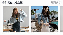
➊ Product Recommendation Belt
To increase product views and average browsing time during Double 11, we added a horizontal product recommendation belt, allowing users to explore relevant products without leaving the current page.
The belt stays compact to increase product exposure while minimizing disruption to product browsing and interactions.

After launching on 10/29, average product views per user increased to over 3.
➋ Campaign banner
To increase the new-user registration rate during Double 11, we used an attractive sign-up incentive to encourage new users to register.
The banner was designed to be quickly dismissible, minimizing disruption to the existing product browsing experience.


After launching on 11/5, the registration rate increased by 0.4 percentage.

bottom of page