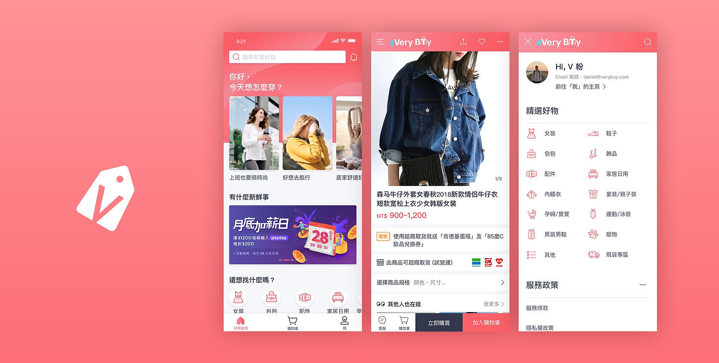
E-commerce Mweb Revamp
Due to increased advertising, we aim to enhance user experience on the Mweb e-commerce platform, especially during the Double 11 mega sale. We plan to optimize Mweb to improve overall shopping experience, increase product views, add-to-cart actions, and boost purchase intent, ultimately driving app downloads and fostering loyalty.
User Experience Design Techniques
-
Clarification of Pain Points for Existing Users
-
Personas
-
User Journeys
-
Site Map
-
Low-Fidelity Wireframes, High-Fidelity Mockups, and Prototypes
-
Design System and UI Kit
-
Usability Tests and Findings
Business Objectives
-
We hope to leverage the user traffic during VeryBuy's anniversary sale in September to familiarize users with the new interface of Mweb and conduct stress testing.
-
During the Double 11 period, we aim to enhance ATC (Add to Cart), Netscore, average browsing duration per user, and average number of items viewed per user.
Experience Objectives
-
To familiarize website users with the interface of the mobile app.
-
The ultimate goal is to guide users to the app and transform them into loyal customers.
Mature Female Users: Key to Revamping E-commerce Mweb
Based on our previous Persona definitions, we should prioritize mature female users as our primary target audience because their characteristics and preferences are crucial for achieving our goals. Through regular surveys, data analysis, and qualitative interviews, we have gained deeper insights into their goals, expectations, and purchasing motivations. To increase loyal customers' add-to-cart rates or user browsing duration, we should focus on these mature female users. By tailoring product selection, copywriting, and UI design to their preferences, we can enhance their engagement and loyalty.

Key Optimization
➊ Product Size / Color Selection Experience Enhancement
Addressing What Issue?
In the old version of MWeb, users need to click multiple times to confirm their selection of product specifications when placing an order. The interface lacks intuitiveness, resulting in longer processing times.
Iteration
-
In the new version of MWeb, all product specifications are consolidated in a modal. Users can now click "Add to Cart" once to quickly and accurately confirm product information, reducing the time required for the process.
-
Clicking on related specifications will display corresponding product images, preventing users from placing incorrect orders and enhancing the overall shopping experience in product selection.
Before
After

➋ Revamped Discount Voucher Optimization
Addressing What Issue?
In the old version of MWeb, users were only provided with discount codes when placing orders, which were difficult for users to remember.
Iteration
-
The new version of MWeb provides a dedicated "Coupon Zone" where users can "one-click" to claim coupons, and they can also access a list of available vouchers for redemption during the checkout process.
-
The checkout process has been split into two steps to provide clearer checkout information. The "Proceed to Payment" button is uniformly positioned for easy access, reducing the time and effort required for users to place orders.
Before
.png)
After
.png)
➌ Revamped Recommendation System
Addressing What Issue?
The homepage layout serves as the user's first impression of the e-commerce platform, aiming to capture their attention and interest immediately, encouraging them to explore further. In the old version, the placement of products was primarily driven by operational considerations, failing to effectively cater to the diverse preferences of the majority of users.
Iteration
-
In the new version of MWeb, besides showing related products based on users' browsing history, the recommendation system also includes high-click-rate items to diversify product suggestions.
-
The recommended slots are backed by technical support, allowing users to seamlessly explore products without conscious effort.
Before
After
.png)
Usability Testing
Business Objective Validation Item:
Determine whether users naturally explore the VeryBuy product detail page after being directed through GDN (Google Display Network) and Facebook paid advertisements. Additionally, assess the ease with which users successfully add items to their cart, place orders, and engage with any page on the site.
Experience Objective Validation Item:
Through usability testing, identify deeper insights into users' online shopping behaviors and preferences. Within a limited timeframe, optimize design techniques to better meet user needs and enhance the overall user experience on MWeb.
.png)
✔
Participant Criteria for Comprehensive User Experience Paths
✔
Quantify and evaluate usability scores through SUS questionnaires to instill confidence in the team for deployment.
.png)
.png)
Performance
➊ "ATC (Add to Cart) rates have seen a slight increase, rising from 4.85% to 5%." 👏
.png)
➋ After the revision was launched, the smoothness of the network/app fell within the range of good 👍 static scores.
User Questionnaire:
Actual number sent: 16,761
Number of recovered samples: 804
Effective response rate: 50.13%
Research Method:Net Score
The net score value represents the difference between the "highest overlap" and the "lowest overlap". Developing countries often use the net score value to calculate the range of merits (sizes). Highlights: 60 ~ 100 is excellent , 40 ~ 59 is good , 30 ~ 39 can be better , less than 30 disadvantages.

"Before Double 11 after the launch of Mweb, we aim to enhance the indicators of ATC rate and average browsing duration through some design methods, in order to improve our overall checkout conversion rate."
➊ Layout : Belt
Business Goal
During the Double 11 period, increase the number of items viewed by users and their average session duration.
Design Goal
-
The belt slot should allow users to quickly view items of interest.
-
The slot should not occupy too much screen height and should delve into user interaction states, considering the relationship between screen height and information display format.
Measurement of Performance

Increase Avg Duration & ATC

➋ Layout : Forced Campaign banner
Business Goal
Attracting new users to register as members through exceptional discounts.
Design Goal
-
Products can be quickly closed by users (to avoid user aversion).
-
Banner image benefits perception needs to be intuitive enough to attract user attention.
Measurement of Performance
Increase registration rate
➊ Belt Performance
➋ Cover Banner Performance
After the belt function was launched at 10/29, the average number of products viewed per person reached more than 3 times.
11/5 After the banner went online, the registration rate increased by 0.4% .


➌ The overall performance of the e-commerce Mweb
During Double 11, the browsing duration performance of MWeb remains similar but shows a slight improvement.
.png)
During Double 11, the proportion of users placing orders 2 or 3 times on MWeb increases.
.png)